Logo
B. Purenn brand logo consists of symbol B. and text. All graphical proportions must be used as showed in these guidelines. Constant and unchanged use of the logo helps to make our brand instantly recognizable at all sizes and in all contexts.

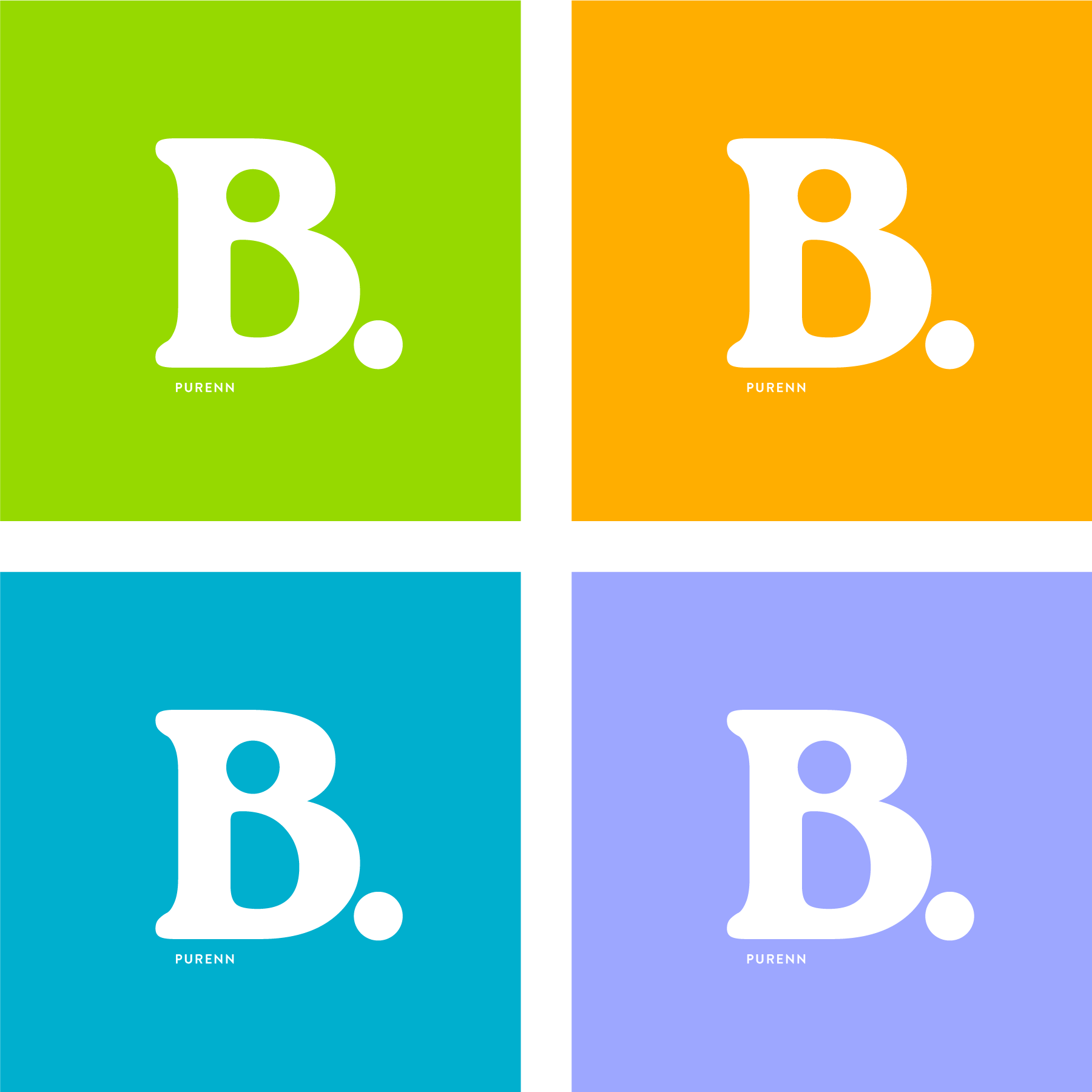
Colour on packaging
Brand logo must be used in white colour on all the packagings.
COLOUR ON OTHER BACKGROUNDS
Logo colour depends on brightness/darkness of the background. Logo is mainly used white on all backgrounds. Except cases when contrast to the background is too light. In such cases logo should be black to ensure the visibility.

POSITIONING
When logo should be used on small areas, it must not be centered automatic, but optical as shown in the example below.
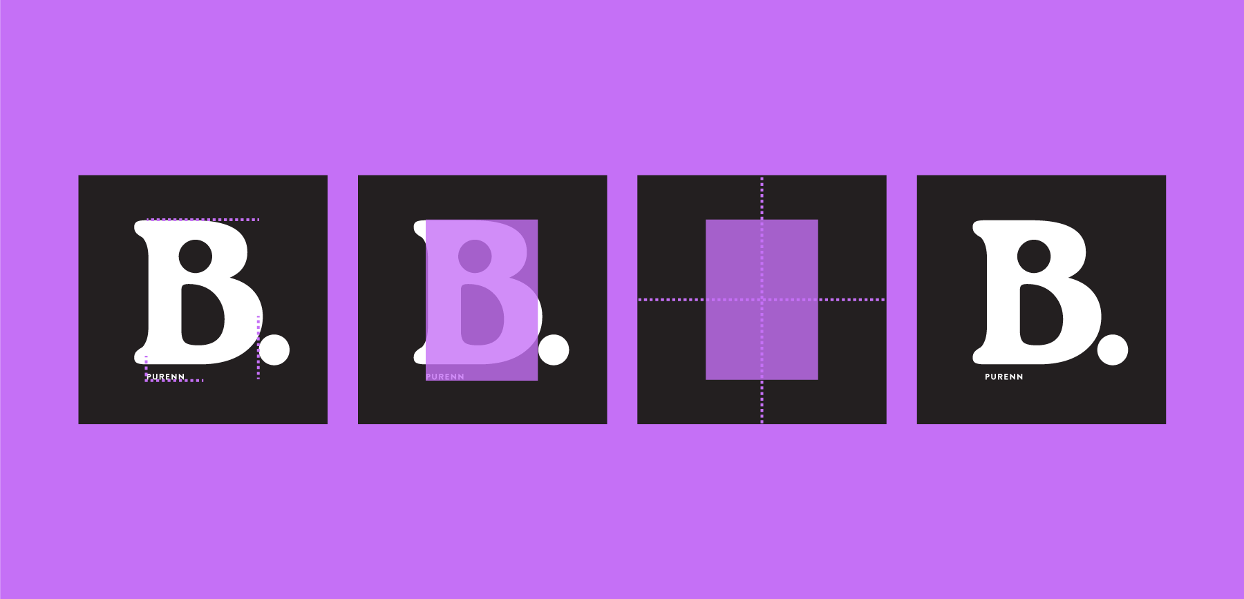
CLEAR SPACE
Free space around logo indicates the area where no other graphic objects can appear. It also shows how close the logo can be to the material border. Clear space around the logo is equal to the width or height of the shape shown below. Width on top and bottom, height - on the sides.

Slogan
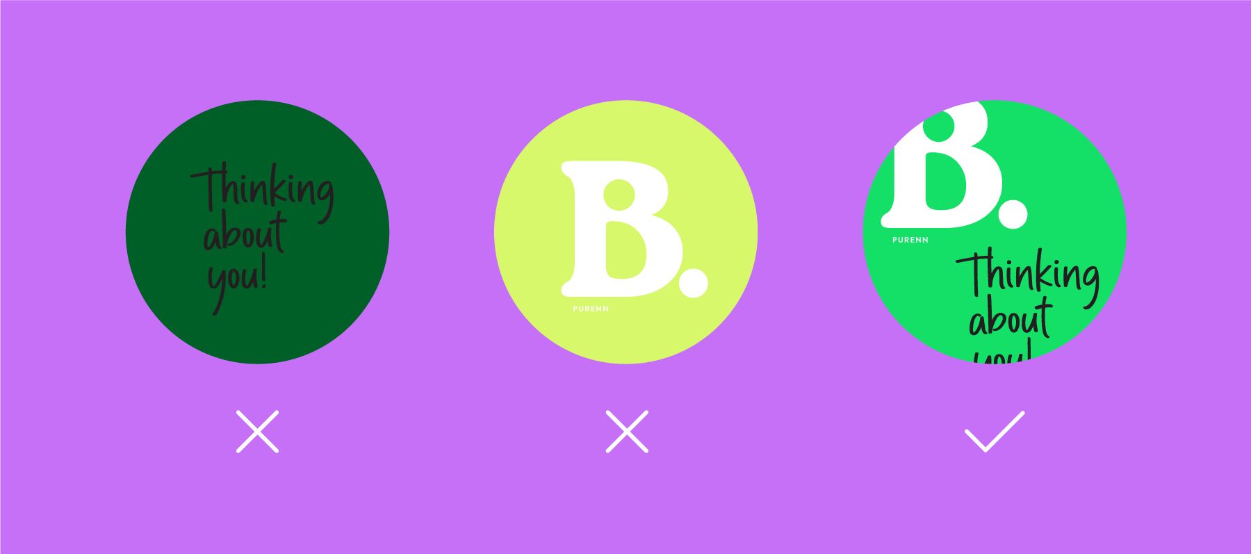
Brand slogan includes text "Thinking about you" in handwriting type to give personal and caring feeling to our brand customer.

COLOUR ON PACKAGING
Brand slogan must be used in black colour on all packagings.

COLOUR ON OTHER BACKGROUNDS
Slogan colour depends on brightness/darkness of the background. Logo is mainly used black on all backgrounds. Except cases when the contrast between background is too little. In such cases slogan should be white to ensure the visibility.

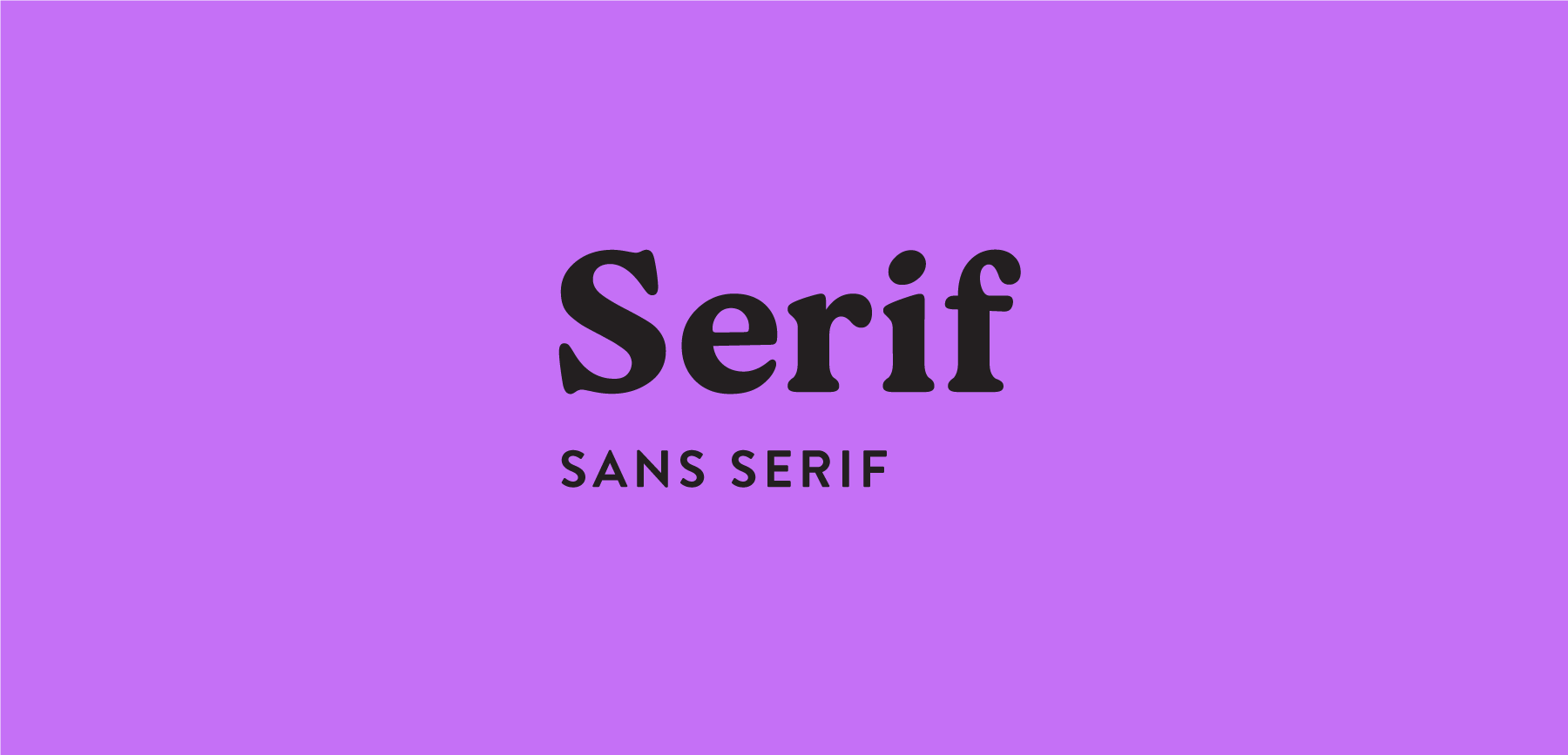
Typography
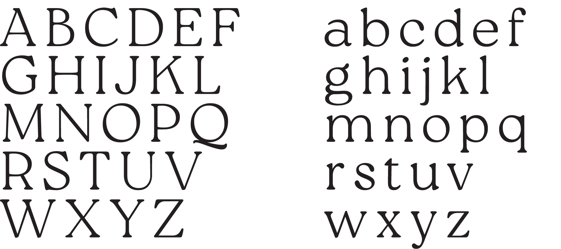
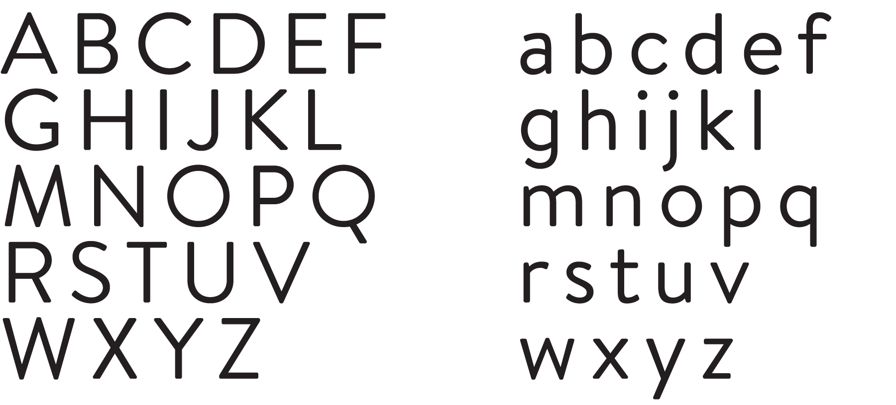
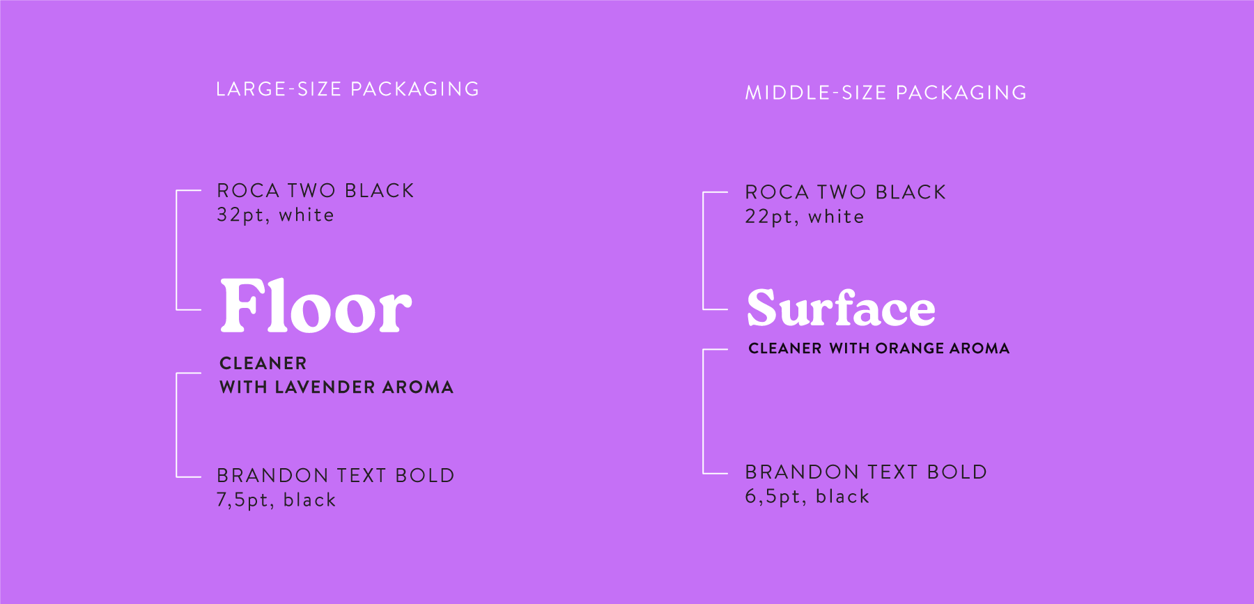
Our brand uses serif and sans serif type combination. Main types which must be used in all communication materials and packaging is Roca Two Black (serif type) and Brandon Text Bold (sans serif type). When it is necessary other widths from main font family can be used - for example - Roca Two Regular/Thin and Brandon Text Regular.
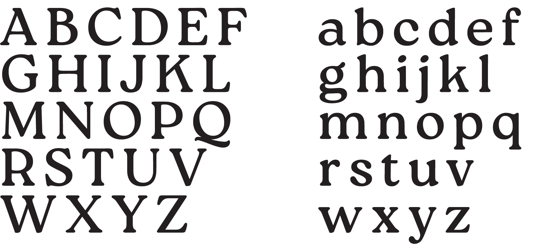
There are also technical/alternative types for common use in electronic media, presentations and other cases when main types is not available - Noto Serif (to substitute roca two) and Noto Sans Serif (to substitute Brandon Text).
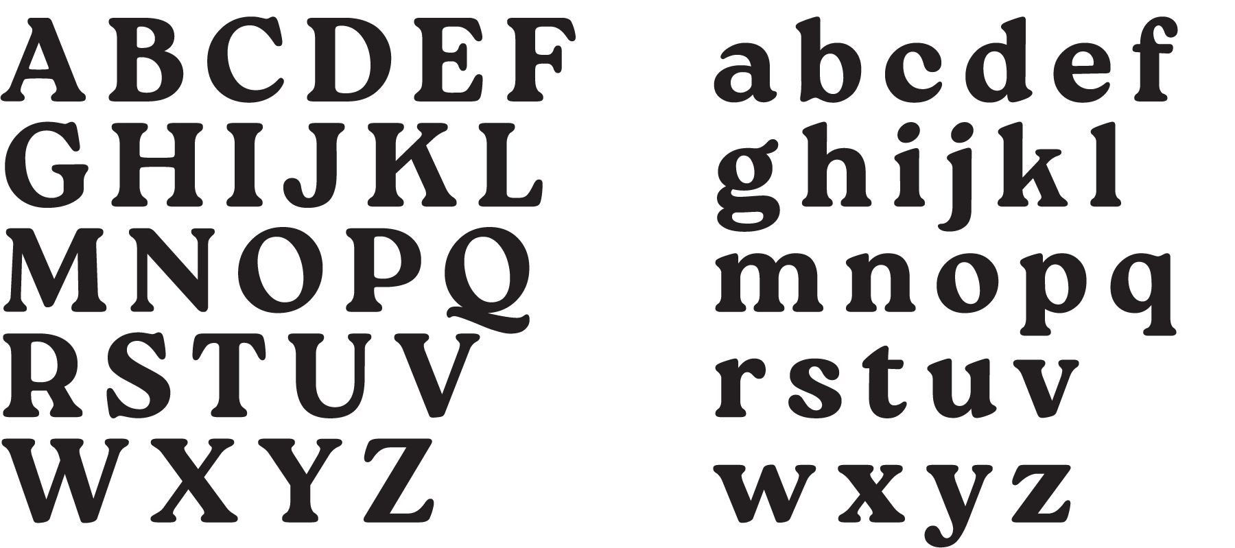
ROCA TWO
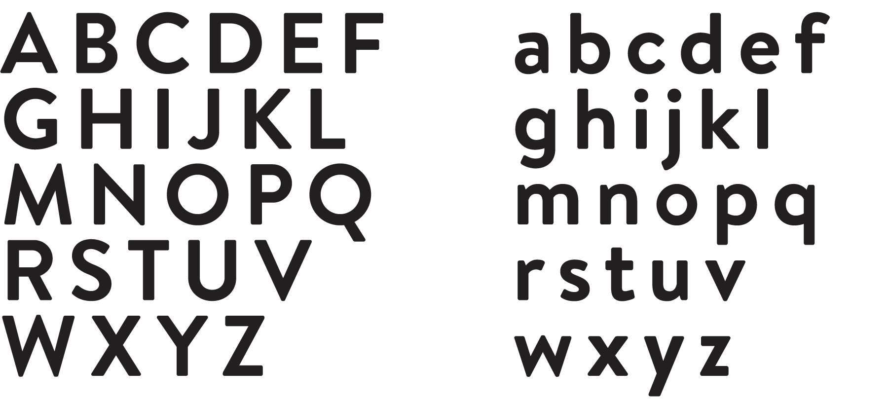
BRANDON TEXT
FONT USE EXAMPLES ON PACKAGING
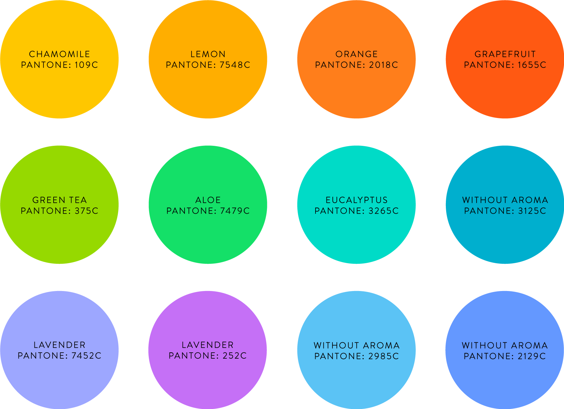
Colours
All colours used on packaging should be bright and vivid to have best contrast with both white logo and black slogan. Too dark coloured background won’t be compatible with black slogan. Too light coloured background won’t contrast enough with white brand logo.
COLOURS ON PACKAGING
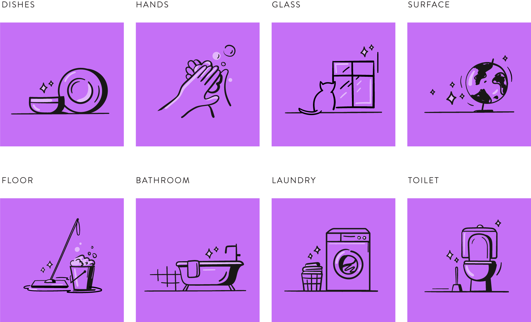
Illustrations
Each packaging has simple and clear illustration representing use of the product. Illustration should always include reference to cleanliness - bubbles, sparks, light lines etc.